Deaf Bible
– Deaf Bible Society
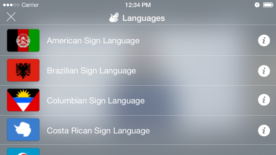
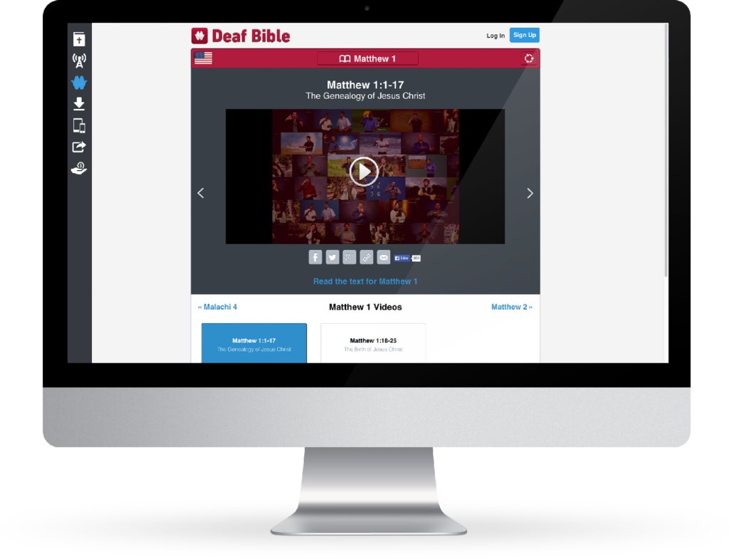
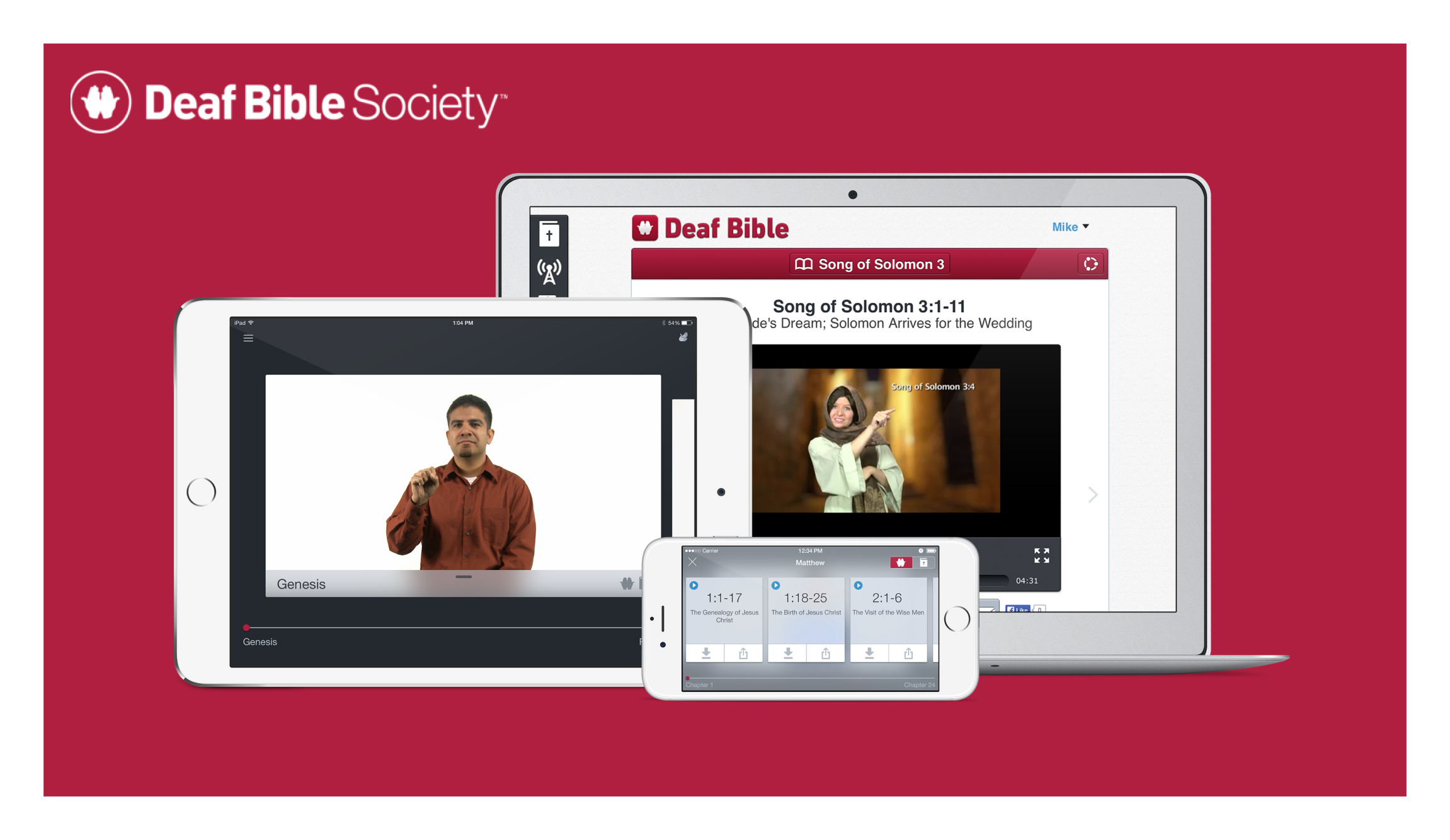
Deaf Bible is an iOS, Android, and responsive web app designed to help deaf users around the world better understand the Bible by offering video scripture content in multiple sign languages presented in a simple and effective UI.
Research
It became clear very early on in this project that I didn't know anything about designing solutions for people that are deaf. So before putting any UI sketches on paper, I spent time with key stakeholders with a deep understanding of this audience.
The biggest assumption that I carried with me into this project was that deaf users can communicate like hearing users simply by using written forms of communication. This turned out to be false. Deaf users can understand written text, sure, but for most this is not their natural language. Sign language conveys so much more depth and meaning to this audience than written language.
The problem statement for the project was simple:
How might we offer content to deaf users around the world in their natural language so that they can understand the message of the scripture in a meaningful way?
Prototypes
With these user personas in mind, I lead a team through a quick session of creating prototypes that explored different ways of navigating, consuming, and sharing the video content that we had available. We then used those prototypes with deaf audience members from a local church to see if we were moving in the right direction. Turns out we weren’t.
Relying on text to communicate anything meaningful in the application was presumptive, as navigating massive amounts of scripture via text made it difficult to find anything the users were actually looking for. We took the feedback from these users and went back to the drawing board. We had to rethink how to present the content.
UX & UI Design
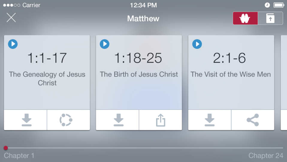
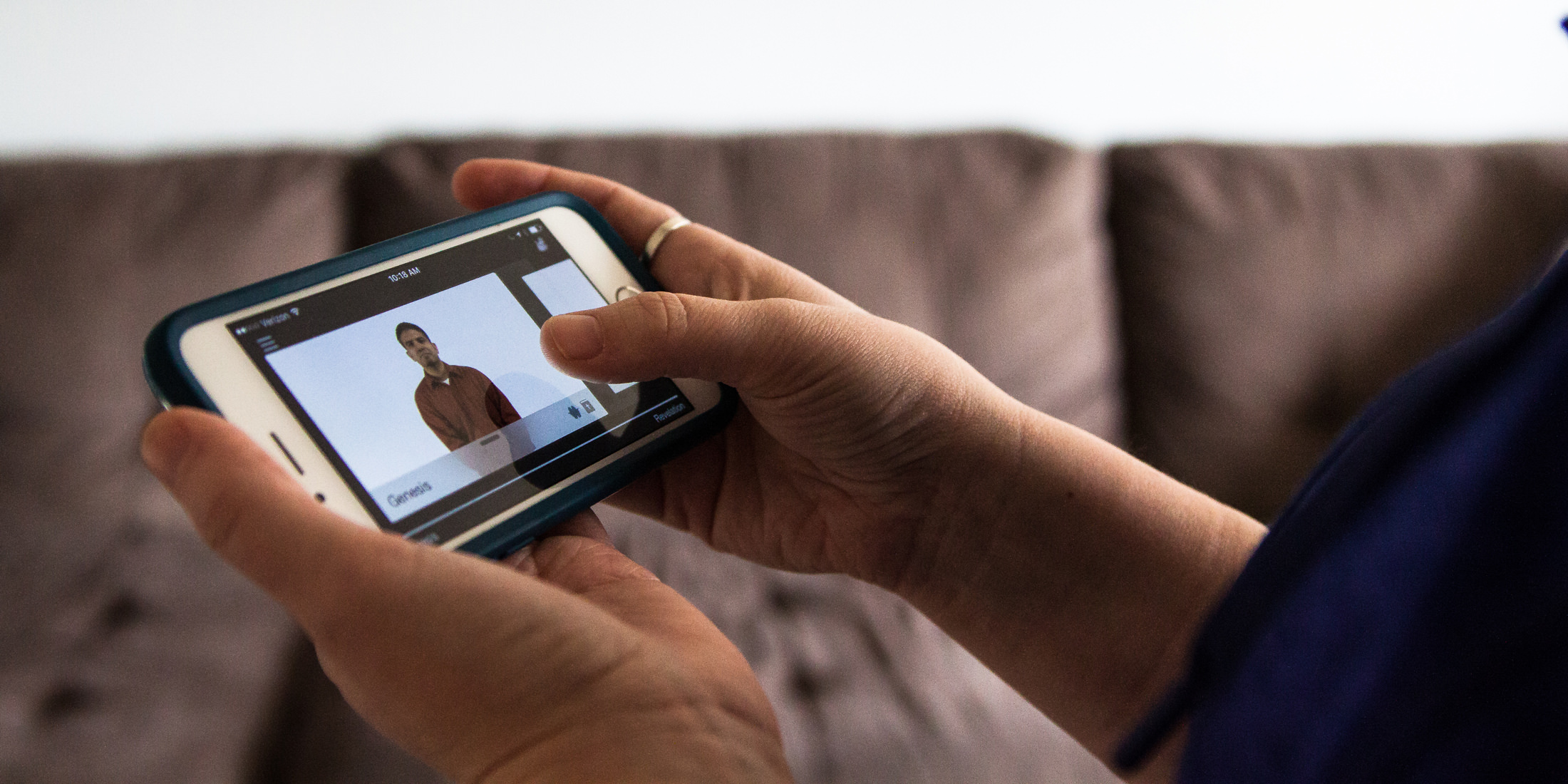
A few rounds of feedback guided me to explore a simple video-based navigation that allowed deaf users to understand what they were looking at right away. Another interesting insight was that many people that are deaf prefer to use their phones in landscape orientation, so I made our UI follow that pattern of usage. After confirming that we were on the right track with the design, I worked hand-in-hand with our mobile developers to create a polished app experience.
The Result
The results of the design are an app with a 5 star average on iOS and Android stores and a community of deaf users around the world who are appreciative of the thoughtfulness of the design of an app that they can tell was made for them.
What I did
Human Centered Design Facilitator
Rapid Prototyping
Usability Testing
Information Architecture
UX Design
UI Design
Clickable Prototyping
Design Documentation
Front End Development
QA

