DadTime
– MDRC
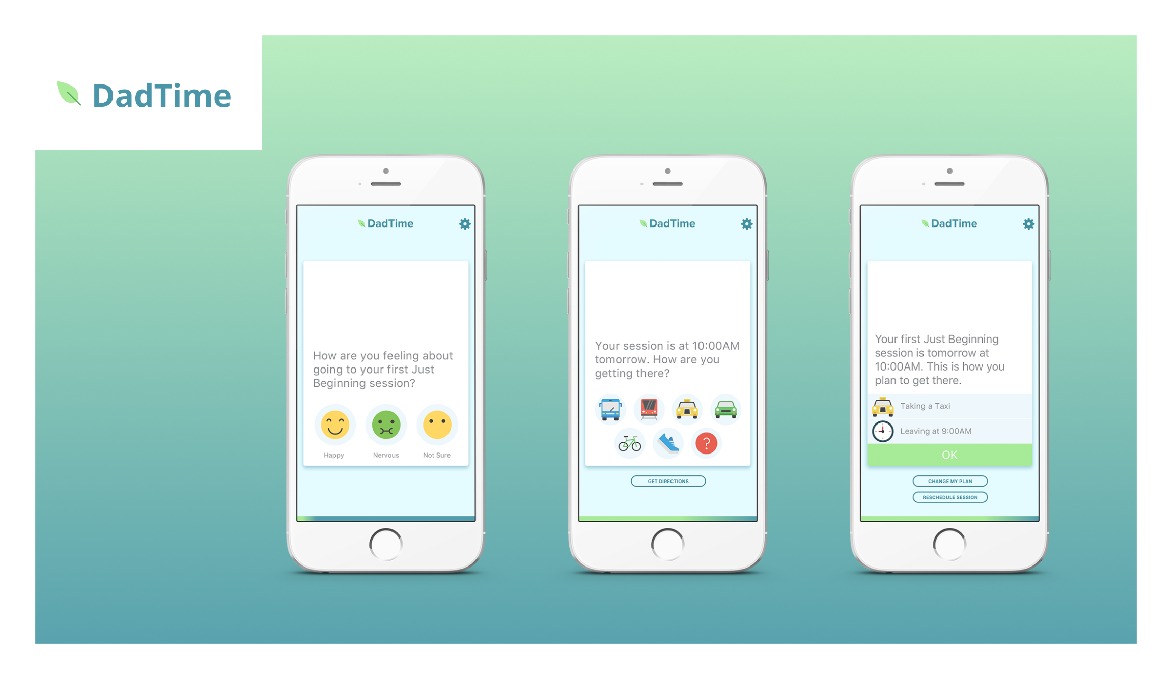
DadTime is an iOS and Android app designed to improve the well-being of low-income fathers and their children by addressing societal and personal barriers to positive involvement.
Does the efficacy of in-person programs increase when it is paired with a digital companion app?
That's the question MDRC was interested to answer with the introduction of the DadTime app. However, what that app needed to be like so that it can be most effective was an open question.
Personas
Any project that solves problems for people starts with understanding those people. A great way to get started is by developing personas for the people that you are creating solutions for. The project team spent several hours together getting to know our audience. It's important to note that several members of the project team had years of personal experience with this audience. This was not time spent plucking ideas about our users from our imaginations.
A few crucial themes emerged during this persona exercise. This audience is overburdened, marginalized, and can have a low level of literacy.
Our problem statement was:
How might we offer our users the right content at the right time so they might have a quick and meaningful learning interaction?
Prototypes
In just a few hours, I was able to create a working clickable prototype to test some of our initial concepts. I then took this prototype into the field and gathered feedback from real end-users. Some trends appeared in the feedback that required consideration; mainly, simplify, simplify, and simplify.
I took the prototype back into iteration mode, trimming down the content, taking out a few steps, and reworking the information architecture. After another round of testing we found that this revision was really well received by end users. We knew we had something to work with now.
UX & UI Design
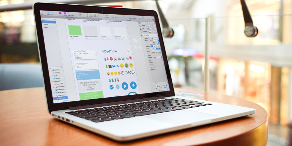
Over the next few weeks, I worked with the development team at CauseLabs to fill in the gaps of the prototype, creating the final UI design, and delivering a robust hand-off document which defined the functionality of each part of the application that would serve as a guide for the development team over the coming months.
End Result
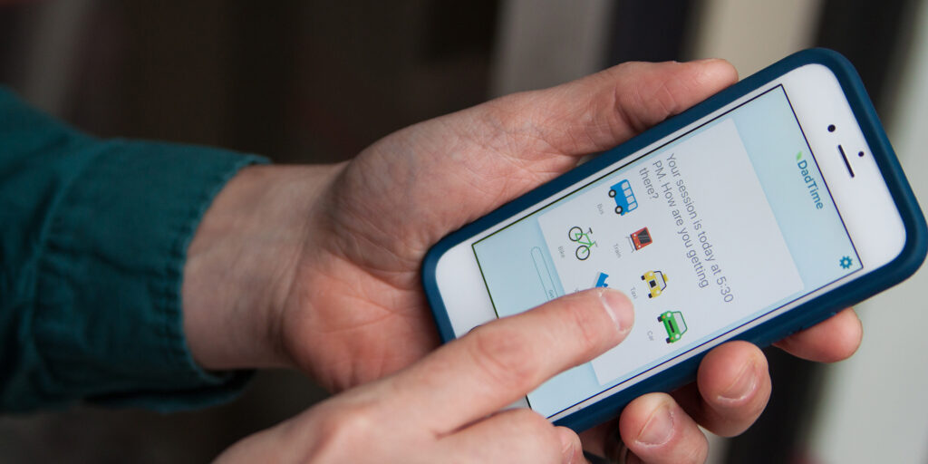
The final app design paired seemlessly with in-person classes that the users were required to attend. The app sends helpful reminders about upcoming classes, along with simple steps to plan for how to get to class. Between classes the app sends simple and quick interactive practices to help codify what had been learned in the previous class.
The study is being evaluated to answer if a digital companion app is helpful in supporting engagement with in-person programs.
What I did
HCD Workshop Facilitator
Rapid Prototyping
Usability Testing
Information Architecture
UX Design
UI Design
Clickable Prototyping
Development Support
QA


